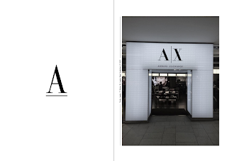
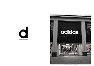
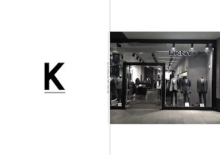
After receiving feedback from my peers I recognised weak areas within the last layouts such as the type layout, the inconsistency became too much for the eye. So from further developing the publication I came towards a much more refined booklet. This design decision proved legible and easier for the reader to engage with. The fact all letter are continuously within the centre of the page gave a minimalistic visual that is a more comforting read. The use of black, grey and white became effective in the theme I was approaching.


No comments:
Post a Comment