Saturday, 28 March 2015
Friday, 27 March 2015
OUGD404 - Studio Brief 02 - Perfect Binding
Materials & Tools I'll need to perform a Perfect bind:
- Paper
- PVA glue
- Clips
- Book press (clamps, vice)
- Glue brush
- Stack the pages equally on each side
- Place a clip on the pages to keep them together
- Put it into a book press
- Then apply the first coating of PVA glue
- Once dry apply one or two more coats of PVA glue
I've decided to go with the perfect binding method as it best suits my genre of book. My pages are also going to be printed on light gloss paper which will keep a nice professional flow allowing the book to be consistent with the binding.
Wednesday, 25 March 2015
OUGD404 - Studio Brief 02 - Book Layout Research
I quite like how this book doesn't have to much information/text within fewer pages, as it gives that minimal look especially with the alignment of the text and imagery. I also think the trim along the front cover & 3rd page allows it to have more cleaner look which i think i will apply within my own page layout
I do like how the book is just black and white & the chosen typeface is a serif, giving it that old sense but at the same time its modern in the sense of its minimal layout with the crisp white stock. Considering there isn't colour I still think this book would be eye catching.
I think having some pages as imagery is rather effective as it makes the book a lot more simpler in my mind, that the imagery is just as important as the information. In a way it complements the opposite page as it exaggerates the blank space. I really find its simplicity relaxing, instead of over complicated books which hold to much information but no visual satisfaction.
I like how different the layout of this book is such as some text fill is black then some is white, there being no consistency but still is aesthetically pleasing, which makes it more exciting turning to the next page as its most likely to be different. The use of opacity has been used effectively as it complements the background stock & the black grainy texture within the imagery.
Tuesday, 24 March 2015
OUGD404 - Studio brief 2 - Hacienda Research
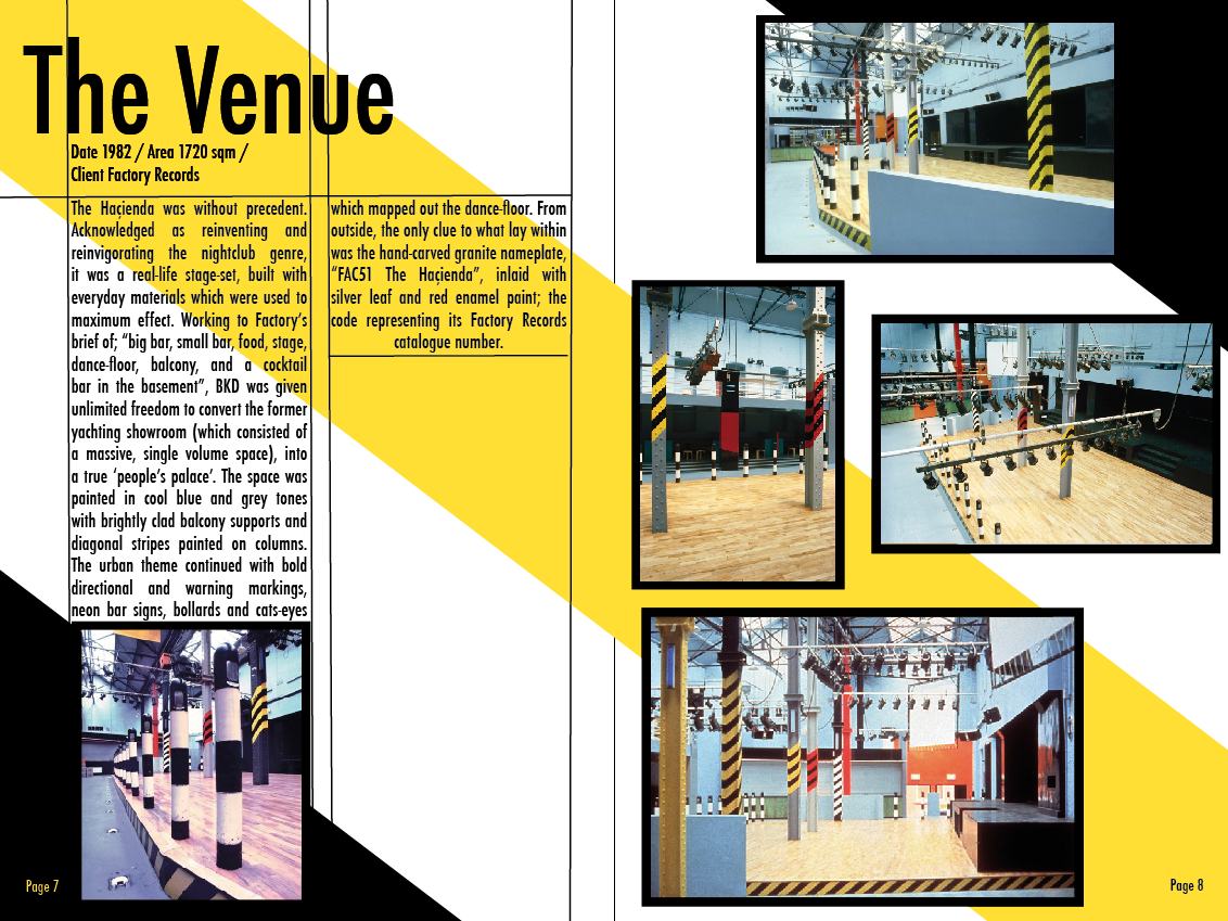
Looking through this book 'Factory records' has allowed me to gain a various amount of visual information such as the colour palette of the interior design within the venue. giving me a sense on what kind of style i should base my book on. Peter Saville was the Graphic designer for all work to do with the Factory records label & Ben kelly was the interior designer for the club 'Hacienda'
Monday, 23 March 2015
Sunday, 22 March 2015
OUGD406 - Study Task 1 - Branding & Identity Page - Presentation
As you can see the Tower Works is made up of 3 towers which is now used for designers & creatives as in the past it was used to manufacture gill pins and other textile associated items. We set out to re design the Original logo which we all agreed that the logo was effective as it represented the importance of the towers, as to this day they have kept it apart of there concept. The only problem was that it didn't really communicate design, it came across as industrial still. I personally thought by inserting a hint of colour into the logo would bring it to life an relate to the design studio space. As a group we decided to approach it with a different concept which was still inspired by there original logo, that being a birds-eye view of the top of the towers but turning it into a 3D shape which represented the creative space within the studio. As for the selected typeface 'Helvetica' was chosen from there website video by seeing a sign inside the building.
The original logo wasn't that bad at all so i believed this made it harder to rebrand.
One thing we thought was that it didn't really show that it was a creative space for
studios so that was our starting point.
We were influenced by the studio vibe's collaborative atmosphere and the modern
furniture and colours. We believed that this is what the logo should represent
and the current logo didn't show this.
This was the logo we decided on, the 3 squares showed a bird eye view of the
buildings stacked together showing collaboration within the space thats available and
orange used in the letters representing the bricks.
We also made a website and business cards to show how versatile the logo is and
various colour schemes that could support it.
Overall this mini project showed me how much a team could get done in
a matter of a few hours but i also learned its hard to find a good meeting
point when creating designs.
Saturday, 21 March 2015
OUGD406 - Study Task 1 - Branding & Identity Page - Logo Development
we split up into a groups of 2 to come up with an idea for a logo which would best communicate the Studio, because we had to manage the time that we had we thought it would be easier to cover ground that way, which would allow us to be prepared for the presentation. This design concept came from Gracie & Jessica they approached it from the idea of looking at google maps and seeing TowerWorks from a birds eye view angle. when developing the logo we came up with a slogan 'Creative space' we thought this best suited our logo for when you see a square you think of the space within it such at 20sq metre's.
Friday, 20 March 2015
Subscribe to:
Comments (Atom)


