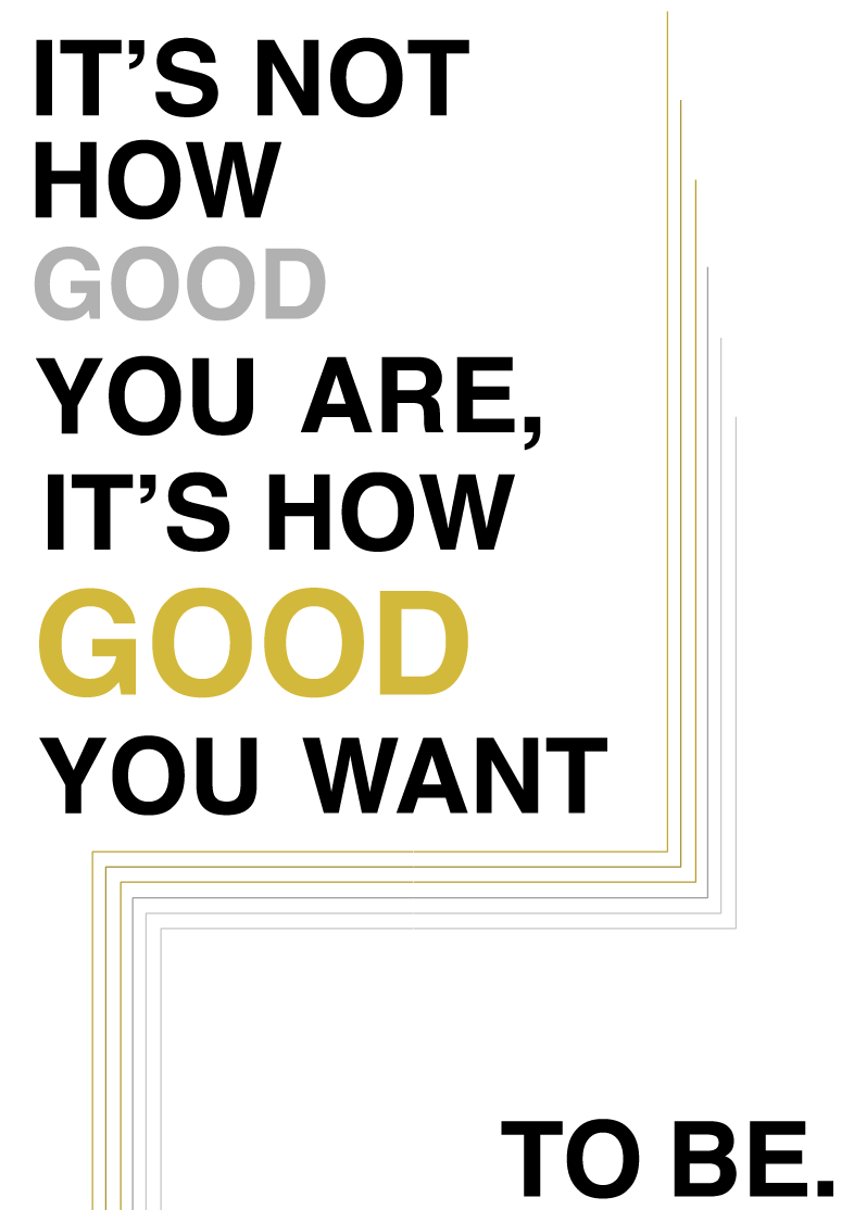
This design can relate to wealth, the bottom being
the poorest & the top being the richest the colours relate also,
I would probably flip this design as you start to read from top left
to bottom right.
I wanted to create one interesting type arrangement cover
as well as keeping the hierarchy correct at the same time.
reading it from top left - bot right then top right - bottom left
Using only one 'Good' to cover both, I personally think its effective
as anyway that you read it still makes sense towards the book.
The patten of this design communicates a bigger scale
of progression stairs placing silver at the starting point and gold
and the top. trying to make motivational visuals.
This design is initially a bolder look of the original cover
but using size to emphasise the word 'Good'
the concept of this design is quite unique & minimal creating that
instant focal point as there is a lot of white space.
Which i believe is easier for the eye, Placing the triangle
in order to allow the purpose of the type arrangement .


No comments:
Post a Comment