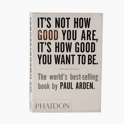
Designed By Roger Kennedy
Intended message is 'Making the most of yourself'
I think the cover is successful in communicating a clear message, from simply using Silver
and gold to imply progression, becoming better at what you do. Very motivational
The text is overwhelming plus the arrangement could be in a setting of progression, such as a podium, pyramid or a 2 word separation line.
I don't think the 'World's best selling book' has to be that size its almost becoming the
focal point.

No comments:
Post a Comment