Saturday, 28 February 2015

OUGD406 - Studio Brief 2 - Book Cover Research

I think Scott Fitzgerald's books communicate well towards the book I'm redesigning for, that being 'Its not how good you are, its how good you want to be' as progression and success come with wealth and riches, becoming the best you can be within your job title. From taking the visuals from this book has inspired me to go with the gold & Silver colours as well as the delicate patterns.


I do like how the black complements the shiny gold allowing the cover to stand out massively, I also think it gives the typeface a more bolder look which allows you to identify the differences between each one. I do find the white book much more attractive as it fully draws your attention to the typography also giving a slight shadow which enables the type to come out of the book.


OUGD406 - Studio Brief 2 - Book Cover Developments


This design can relate to wealth, the bottom being
the poorest & the top being the richest the colours relate also,
I would probably flip this design as you start to read from top left
to bottom right.


I wanted to create one interesting type arrangement cover
as well as keeping the hierarchy correct at the same time.
reading it from top left - bot right then top right - bottom left
Using only one 'Good' to cover both, I personally think its effective
as anyway that you read it still makes sense towards the book.


The patten of this design communicates a bigger scale
of progression stairs placing silver at the starting point and gold
and the top.  trying to make motivational visuals.


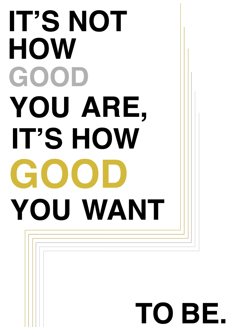
This design is initially a bolder look of the original cover 
but using size to emphasise the word 'Good' 


the concept of this design is quite unique & minimal creating that 
instant focal point as there is a lot of white space.
Which i believe is easier for the eye, Placing the triangle
in order to allow the purpose of the type arrangement .