Thursday, 29 January 2015

OUGD406 - Studio Brief 2 - Book Analysis


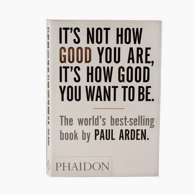
Designed By Roger Kennedy

Intended message is 'Making the most of yourself'

I think the cover is successful in communicating a clear message, from simply using Silver 
and gold to imply progression, becoming better at what you do. Very motivational 

The text is overwhelming plus the arrangement could be in a setting of progression, such as a podium, pyramid or a 2 word separation line.

I don't think the 'World's best selling book' has to be that size its almost becoming the
focal point.

OUGD406 - Bookbinding Layout Workshop

I learnt 3 different types of book binding at the workshop which was very helpful. giving me an idea on what kind of binding method would suit my chosen book content.


OUGD406 - Studio Brief 1 - Secret 7 Finals

ST. VINCENT 


I made it look minimal/simple just to give it that
 visual connection towards the song and the vinyl cover.


The bold coloured shapes represent blank windows.


OUGD406 - Studio Brief 1 - Secret 7 development


After Developing the Peter Gabriel covers i decided i didn't like the out come, I either needed to change my approach to his song or to make the illustrations much better and interesting. I've used the colours which are used within the official video with all the designs to create a more complete understanding for all the decisions i made when coming to the cover. I think when it came to designing the sledgehammer song it influenced me into creating strange illustrations but at first it seemed correct, if i was to go back my designs would probably be less clip art like and more mature. 


Peter Gabriel


After not agreeing with the Peter Gabriel song I then moved onto St Vincent - Digital Witness, I originally had ideas for the cover so i developed them without thumb nails as i had such little time to get them ready to submit. I noticed within the video that she used a lot of different shapes within each scene. So i believed to have thought that there was an interesting focal point within the video, so to apply that to the vinyl cover would communicate a clear message. The message I've tried to communicate with these shapes is that by merging all them together would reflect on the society we live in now, a bold connection which we have with others through the use of technology such as mobiles & applications. 

The colour blue meaning as a Positive - Intelligence, communication,  reflection, calm &
Negative - Coldness, aloofness, lack of emotion, unfriendliness. 
'lack of emotion' is quite obvious within the Official video as the lead singer shows no sign of facial expressions relating back to the colour blue meaning. A positive side to the colour is the 'communication' through the digital witness sense and the meaning behind the song ( about social media and the urge to tweet photos of everything you do a phenomenon that has arisen from the digital age)
St Vincent 


OUGD406 Studio Brief 1 - Secret 7 Artist Vinyl Research

Fred Deakin

Vinyl Designs

What initially caught my eye about Fred Deakin vinyl covers was the shapes & colours used, as well as the circler holes within the first cover which is rather unique. The colours are really bold and in your face, such as the 3rd one down it has a sense of relaxation/warming and a shape which looks like a flower blossoming. Even though there isn't any typography on the cover i personally think its aim is to suck you into the over layered geometric shapes, to add type would be to create an extra attraction within the design.


OUGD406 - Studio Brief 1 - Secret 7 Thumbnails

After watching the Peter Gabriel official video multiple times there was alot of distinctive imagery throughout and hidden meanings behind the lyrics (the song itself) being about sex. There was alot of obvious imagery within the video which other people would probably approach so to stand out would be rather difficult. When coming to my thumb nails my drawings became quite clip art like illustrations which i didn't necessarily agree with. I personally don't think i agreed with designing a vinyl cover for Peter Gabriel - Sledgehammer song as my designs & the video was to immature for my liking

Peter Gabriel 


Peter Gabriel


OUGD406 - Studio Brief 1 - Vinyl Research

 Peter Gabriel & St Vincent 


From looking at Peter Gabriel's cover designs they're mostly manipulated photography that holds that 80s effect.

St Vincent on the other hand holds that Modern sense, Bright colours the use of shapes and the fact that she visually communicates that higher position such as the 'Queens' role sat on the pink chair with a upright posture and all eyes on her, that being my opinion of the cover. 


What initially caught my eye was the effect used upon the face, Possibly a 'liquify' tool giving it that wooden outcome, Colour hasn't been used within this design for reasons to give it that 70-80s feeling, baring in mind Peter Gabriel was born in the 1950's


I believe that the use of shapes create an unusually attraction, from pre historic symbols that intemperate a hidden meaning. Something so simple is so effective in front of certain photography. 
For example,

Circle Symbol - Meanings
Inclusion 
Focus 
Unity 
                                               Initiation - Secret Ritual ( higher power) 
Perfection
                           Revolution - A new System
Infinity
Completion 


OUGD406 - Studio Brief 1 - Peter Gabriel Song lyrics.


Peter Gabriel - Sledge Hammer

This song is about sex the lyrics are filled with phallic symbols. In addition to the word "sledgehammer" other references to the male member include the train, bumper cars, and the big dipper.

After reading the lyrics i took certain visual elements which developed through thumb nails, taking the strongest designs out of the development to then take it into further manipulation 

you could have a steam train if you'd just lay down your tracks you could have an aeroplane flying if you bring your blue sky back all you do is call me I'll be anything you need you could have a big dipper
going up and down, all around the bends you could have a bumper car, bumping this amusement never ends
I want to be your sledgehammer why don't you call my name oh let me be your sledgehammer
this will be my testimony show me round your fruitcage 'cos I will be your honey bee open up your fruitcage
where the fruit is as sweet as can be I want to be your sledgehammer why don't you call my name
you'd better call the sledgehammer put your mind at rest I'm going to be-the sledgehammer this can be my testimony I'm your sledgehammer let there be no doubt about it sledge sledge sledgehammer
I've kicked the habit shed my skin this is the new stuff I go dancing in, we go dancing in oh won't you show for me and I will show for you show for me, I will show for you yea, yeah, yeah, yeah, yeah, yeah, I do mean you

only you you've been coming through going to build that power build, build up that power, hey I've been feeding the rhythm I've been feeding the rhythm going to feel that power, build in you come on, come on, help me do
yeah, yeah, yeah, yeah, yeah, yeah, yeah, yeah, you I've been feeding the rhythm I've been feeding the rhythm
it's what we're doing, doing all day and night

OUGD406 - Studio Brief 1 - Digital Witness Song lyrics


St Vincent - Digital Witness

Digital witness is about the Hyer socialized society which we live in. Regarding internet social media such as Facebook, Twitter, Instagram etc...
We have constant needs of glorifying ourselves by saying what we do.

Get back, gnashing teeth Ooh, I want all of your mind People turn the TV on, it looks just like a window, yeah People turn the TV on, it looks just like a window, yeah Digital witnesses, what's the point of even sleepingIf I can't show it, if you can't see me What's the point of doing anything?
This is no time for confessing I want all of your mind People turn the TV on, it looks just like a window, yeah People turn the TV on, it looks just like a window, yeah
Digital witnesses, what's the point of even sleeping? If I can't show it, if you can't see me
Watch me jump right off the London Bridge This is no time for confessing
People turn the TV on and throw it out the window, yeah Get back to your stare I care, but I don't care Oh oh, I, I want all of your mind Give me all of your mind I want all of your mind
Give me all of it Digital witnesses, what's the point of even sleeping? If I can't show it, if you can't see me What's the point of doing anything? What's the point of even sleeping? So I stopped sleeping, yeah I stopped sleeping Won't somebody sell me back to me?

Wednesday, 28 January 2015

OUGD406 - Studio Brief 1 - Professional Practice - Secret 7


LIVE BRIEF


For this brief I'm going to design a record sleeve for the secret 7 competition.
There are 7 music artist to choose from which I'm going to explore each one to see what suits me best.
After Selecting my artist i will then further research into the artists visuals and lyrics, taking out certain elements to create a record sleeve.

The Artists


I'm stuck between both these artists only because i really enjoyed the official videos, having very strong visuals that gave me a few instant ideas.   


When it came to designing a viynl cover for this song most my designs were to animated & strange looking which i didn't like about the designs, The video was just a bit to insane for my appreciation. 


OUGD404 Design Principles - Study Task- Folds


After looking on 'youtube' and 'Making a booklet/hotdog' this has allowed me to create my own booklet which was a much simpler version of a binded booklet, preferably using that method to get a quick over view of the book design 


Once printed off i will then fold the pages myself, making sure the document is accurate otherwise i will come across a few problems.
I also had to flip the top section of the page in order for it to be the right way once folded.


Tuesday, 27 January 2015

OUGD404 Design Principles - Study Task- Folds research

I took some time to look into setting up a booklet document, that'll allow me to create a 6 paged booklet by only using 1 A4 page creating an A5 booklet.

This is the users thumb nail page layout, making a few changes on mine from this 
video will allow me to create my own booklet


The page layout, but notice facing pages is turned on, that'll need to be off
in order to create my booklet.
theres only 1 page overall but using the 6 pages to merge into the 1.


Turning off the document pages to shuffle will allow me to move the pages into 
the one page at the top, so i would place all 6 into one page.


The outcome will be different on mine for all 6 will be on page, but this is how it will be lay out.

OUGD405 - Evaluation


This module has allowed me to come to a comfort zone with using the adobe indesign although having slight previous knowledge on the software it was interesting to find out more about how to set up a book document and how to use it effectively for the studio brief given.
The software did make the job allot easier then expected, only because I have problems organising pages and numbers with the time i had left.

Because I made the mistake of not doing as much work as i should of over the christmas period I came back to the brief unaware and confused which became quite difficult to deal with all at once. My attendance was far worser than my previous module taking in to consideration we only had 2 weeks to complete it.
Being on a tight schedule has caused me to rush my work not working to my full potential which is quite upsetting as i want to enjoy the work i create, so from this I have decided to make a change with my attendance/punctuality giving myself a target of 85-100% attendance.

The positive side to the module was that i still learnt allot weather thats page layout, using the software effectively and creating a fairly standard booklet & end product that being a Menu. I’m quite confident theres room for improvement strictly because of time I had.


What will i do differently next time will be that i experiment more, find more research, study the properties of page layout throughly and most of all have 100% attendance. 

Wednesday, 21 January 2015

OUGD405 - Studio Brief Two - Idea Generation


Different Alcohol Beverages

From past experience working in a bar i thought i would design my own Drinks menu.

When i go to bars i always like to try different kinds of alcoholic drinks just to mix it up,
But then when i go to clubs i always tend to get the same drink all night.

So i find it strange that your mood rapidly changes within certain environments.


Peoples opinions on Alcohol


  • "Don't like drinking, because it prevents you from thinking properly"
  • "A good way to brake the ice, socialise and loosen up"
  • "It enhances the sound of music and allows you to be more confident on the dance floor"
  • "Its good in small doses, drinking to much brings out some badness but a little amount is more safer and enjoyable"
  • "I like it very much but the hang over sucks"
  • "I think it's dangerous and I've never touched a drop."
  • "I think it is bad for health when taken in excess"
  • "I think drinking allows you to have a much funner time with your friends"
Facts on alcohol

  • The human body produces its own supply of alcohol naturally on a continuous basis, 24 hours a day, 7 days a week
  • The word toast started in ancient Rome where a piece of toast was dropped into wine.
  • ancient Greeks believed that a cabbage was a hang over cure.
  • A bottle of Champagne contains approximately 49million bubbles.
  • The production of alcohol has been traced back to at least 12,000 years
  • The average British person will spend a year of there life hung over
  • Part of the reason that people seem more attractive when you're drunk is that alcohol inhibits your ability to recognize asymmetry in a face.
  • When you get blackout drunk you don’t actually forget anything. Your brain wasn't "recording in the first place.
Words relating to Alcohol
  • Toxic 
  • Hang over
  • Socialising 
  • Drunk
  • Dizzy
  • Uncontrollable 
  • Poison 
  • Tipsy
  • Adultery 
  • Selective
  • Spontaneous 
  • Hyper active
  • Confident 
  • Silly
  • Pass out
  • Violent
  • Colourful
  • Strong
  • Tasty 


OUGD405 - Studio Brief 03 - Page Layout Research

I've decided to make a book about various types of drinks, weather thats alcoholic or soft
from researching into already made menus has inspired me to go ahead with the concept of a drinks menu which includes so much more then any ordinary drinks menu.
Seeing as mine is based on drinks i want to involve all the typical things you get when you order a drink, such as lime, lemon, ice, decorations, Costa etc…

I think it would be a good idea to create my own logo only because majority of restaurants are always promoting themselves, also making the menu look alot more professional.


After seeing this design i wanted to base my drinks menu on it, the whole self drawn side to it only because that would save me gathering the various types of alcohol to put within my menu. I also think the final piece would be very interest if organised and positioned correctly 


I like the use of typography on the drink menu as well as the humour behind it, the use of white space has been put into consideration also. this has allowed me to decide weather i want my menu to have a more modern approach, outdated or hand draw look to it.


I like how type has been layed out as well as the old western style...