Tuesday, 28 October 2014

OUGD404 - Anamorphic Typography


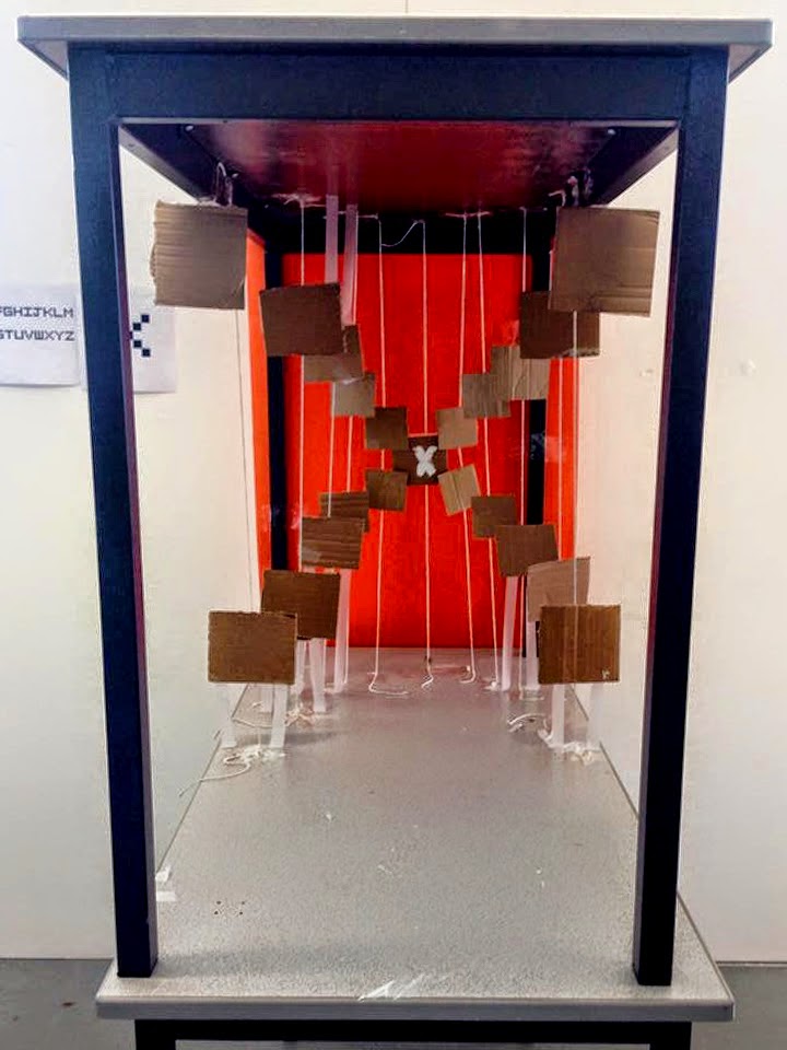
The aim of this studio brief was to create a typeface which was three dimensional using specific materials such as string, Cello tape and card board which we were told to bring in to the session.
We then chose a letter to base our 3D type on which was an X using the typeface 'Airlock' an old pixelated typeface which was on the first ever computors as text.


                  We chose to approach our 3D typeface in a very different way from
                      The other groups, only by using cut out squares to gradually come away 
                         From the Orange back board being inspired by vanishing points, 
                          placing them in a specific position to create the airlock typeface.
                         We placed a table on top of another in order to make this work.


Wednesday, 22 October 2014

OUGD404 - Typefaces


CP1 was assigned to bring in three different typefaces that hold their own characteristics at 10cmx10cm.

"ABCXZY" in uppercase or lowercase, I chose Baskerville, Helvetica and Courier 

We were told to bring three different typefaces to this session. then to swap with others 
 to then simply describe the letters style with one word. After swapping back we chose one of typeface which we thought was most unique. 


I decided to take the Baskerville  particularly because it's quite an elegant typeface. The serif creates a neat and bold traditional structural stance. What i like about the baskerville letter X is how the stroke weights are different on each side, i also find the balance is rather eye catching and relaxing.


The Characteristics of Kefeirville:
  • A mix between Serif and San Serif
  • Good weight balance
  • Active typeface
  • It has it's own personality
  • Creative
  • Elegant
  • Asymmetrical
  • Irregular


The task was to combine our typeface with the other chosen typefaces of the group that was on our table - to design a new letter combing all the characteristics of 8 typefaces together 


We then Dressed up Chris trying to make him look 'Irregular' as that is the definition of our created typeface

Monday, 20 October 2014

OUGD403 Study Task 02 The Golden Ratio


Research Golden Ratio 


Fibonacci & 
Golden Ratio


  • Some twentieth-century artist and architects, including Le Corbusier and Dali, have proportioned their works to approximate the golden ratio especially in the form of the Golden rectangle, in which the ratio of the longer side to the shorter is the golden ratio—believing this proportion to be aesthetically pleasing


  • Fibonacci sequence ratio 8:13 links to golden section. This sequence is not only 
    evident within design but also nature


    1.62
    Forms the basis of paper sizes and its principles can be used as a means of achieving
    balanced designs.

    8:13
    Fibonacci sequence ratio 8:13 links to the golden section 


    This explains how the golden ratio is within nature itself 


    Mona Lisa, is one of the most famous paintings in the world, and is a very good example of Da Vinci's use of the golden ratio in art
    Apparently if the human face follows the golden ratio we find there faces more attractive 


    Canons page

    Van De Graaf


    OUGD403 Study Task Two Grid, layout and composition


    This video allowed me to have a greater understanding of how grids are used.


    I went into illustrator and had a play around with the grid system, there being 4 rows & 4 Collums and a specific space between each icon (gutter) the button and the ear piece has the same width and alignment aswell 


    I then approached the spotify website, I think there are 5 rows an 5 Collums and even space In between each Collums 


    Monday, 13 October 2014

    OUGD403 The Anatomy and Terminology of Type


    Typographers have developed a comprehensive vocabulary for describing the many aspects of typefaces and typography. Some vocabulary applies only to a subset of all scrips. Serifs, for example, are a purely decorative characteristic of typefaces used for European scripts, whereas the glyphs used in Arabic or East Asian scripts have characteristics (such as stroke width) that may be similar in some respects but cannot reasonably be called serifs and may not be purely decorative.


    Typeface: A typeface (also known as font family) is a set of one or more fonts each composed of glyphs that share common design features. Each font of a typeface has a specific weight, style, condensation, width etc
    For example, 'ITC Garamond Bold Condensed Italic' is a different font from 'ITC Garamond Condensed Italic' and "ITC Garamond Bold Condensed," but all are fonts within the same typeface.


    Font: A font is a particular size, weight and style of a typeface. Each font was a matched set of metal, and a typeface comprised a range of fonts that shared an overall design.


    Typefaces can be divided into two main categories: Serif and Sans Serifs comprise the small features at the end of strokes within letters. The printing industry refers to typeface without serifs as Sans Serif (from French sans, meaning without), 


    Oblique is a form of type that slants slightly to the right, used in the same manner a italic type Unlike italic type, however, it does not use different shapes of the a character; it uses the same glyphs as roman type, except distorted. Oblique and italic type are technical terms to distinguish between the two ways of creating slanted font styles; oblique designs may be labelled italic by companies selling fonts or by computer programmes.

    Sunday, 12 October 2014

    OUGD403 - Studio Brief One Alphabet Soup

    Being put into groups to deconstruct the word flamboyant defining the word to get an overall summery of the meaning e.g bold colours, feminine chicago film 1920's style etc


    Then being given our own word to deconstruct, mine being 'Movement' an from choosing helvetica as my personal typeface i have to base it on that font.
    The reason why helvetica was my chosen font was because of the simplicity of it as i tend to try and go down the simple path rather then the difficult path, the reason being is i hardly understand alot if not simple.
    it being the most illegible typeface which suits my needs in being able to read it.

    Movement


  • Body movement
  • Directions 
  • Political Movement
  • Progression 
  • Art movements
  • Diagrams
  • Motion 
  • Optical illusion
  • 10 Final Ideas
    I've decided to go with this typeface
    just because i think it is a lot more
    unique from the others and i think
    it could be a good end result.
    it has the Helvetica's body but
    i have slightly manipulated certain
    areas of the typeface just so it fits in
    with the grid system i have chosen to
    go by. What inspired me to do this idea
    was a combination of research as well
    as circuit boards that are used in electrical
    boards.


    This idea was based on the life support machine, there is movement when there is life, i used the helvetica body because it was my chosen typeface from the brief ‘Whats my type’ as an outline. orignally i was going to have just one stroke throughtout but it was just to plain an simple there was no unique look to it so by adding lines which didnt fully connect became much more appealing.


    This design was inspired by the display which was at the Henry Moores gallery, the moving soundwaves in which we are surronded by. I liked the concept of the idea but i still thought it was slightly simple an again didnt appeal to me but if i was to further develop the idea i reckon a good design could spring up from it. 


    This design was simply a fire themed design to me it was obvious that fire communicates movement as the fire travels from the air its fed, being uncontrolable. this design did not appeal to me that much because it almost seemed so childish and boring, the experimentation would be rather fun to the point of setting 3D letters alight to then put some photography skill into it. 


    Road type


    With this style i have only created a serif
    arrowhead representing movement and direction, this particular style relating to road signs.
    I believe this style to be to simple and obvious to the word i was given 'movement' but it did help me generate various other styles instead.


    Subway Type


    Basing this typeface on the original helvetica font, the difference being that
    it has one outline rather than a joint outline not being able to fill it.
    Communicating movement through transport as it is one of the biggest
    definitions towards movement itself. The points signify each stop and the 
    reason for the zigzag is change of direction.


    Ive looked into Massimo Vignelli who designed the subway 
    diagram in Manhattan which has given 
    me an idea of how to edit colour and the pattens


    When coming across these geometric wire sculptures it 
    reminded me of the subway typeface i designed
    only because its so zigzagged and at each end of 
    the wire it has a point that reminded me of 
    the destination stops at the subway.


    It only sparked off other ideas in the sense of creating
    my own 3D wire model typeface to put but my completed 
    alphabet just to make it a bit more interesting and interactive.


    I took time to visit a art gallery to hopefully come by some inspiration that can relate to my brief. 


    After visiting the Henry Moore's art gallery i stumbled across this illumines light over lapped oval display, giving me inspiration into my given word 'movement' the display reminding me of the sound waves which music produces.


    Friday, 3 October 2014

    OUGD403 Brief 1 Study Task 01 - What type am I?


    When are you happiest 

    Achievments
    when i have done something I'm proud of completing 


    My greatest fear


    These crazy ugly things 
    try killing me,
    every time one is around it
    chasing me!


    My happiest memory  

    Thailand!
    Going to Thailand for new year was one of the best experiences I've 
    had so far, Counting down from 10 and having the most 
    incredible view of the Island strip for the firework display, the water 
    being so clear the fireworks reflected off it.


     My most embarrassing moment

    Random hallways
    Being found passed out in a 5 flat apartment, 
    god knows how many people walked passed me!