Extended Practice
Monday, 15 May 2017
OUGD603 - Brief 07 - Square Space - Evaluation
Entering this competition was fun because I worked with website templates, something which I haven’t done much this year but really enjoyed doing in second year. I also had the opportunity to use my own work as demo content and place the finals on mockups. Creating web, tablet and mobile mockups is something I have experimented with for a long time, but not fully taken into consideration of the distinctive layouts / screen dimensions until now. Trying something new came as a challenge, but a comfortable one. I felt that visually using my own work as demo content helped me understand and communicate the aim better by reflecting back and questioning what it is that I would want from a website as a designer and creative, to get hired.
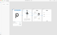
I enjoyed coming up with page sections and felt the overall website easily allowed user to inform others of their practice. There are 3 pages: the about me, the projects and the content page.
Although the outcome is fairly realistic, I feel like I could have done better by adding more interactions. However the software I used to design the web Experience Design, has a lot of limitations when it came to being creative and using cursors.
Saturday, 13 May 2017
OUGD603 - Brief 07 - Square Space - Development

By taking the sketch into Experience Design to create an interactive portfolio to give me an accurate outcome &
give me an understanding of how the application works. Linking the tabs to the correct page & placing relevant
content on each one. Experience Design was fairly easy to use but is limited in what you can link up. I wanted to make the scroll as an interaction but couldn’t quite figure it out, the same with linking the socials together.
OUGD603 - Brief 07 - Square Space - Design Development
Subscribe to:
Comments (Atom)


